Laboratory Oil
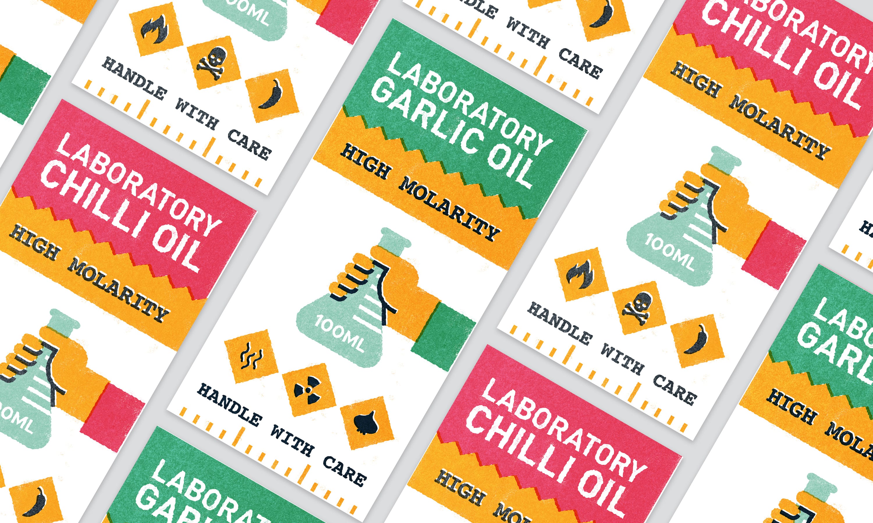
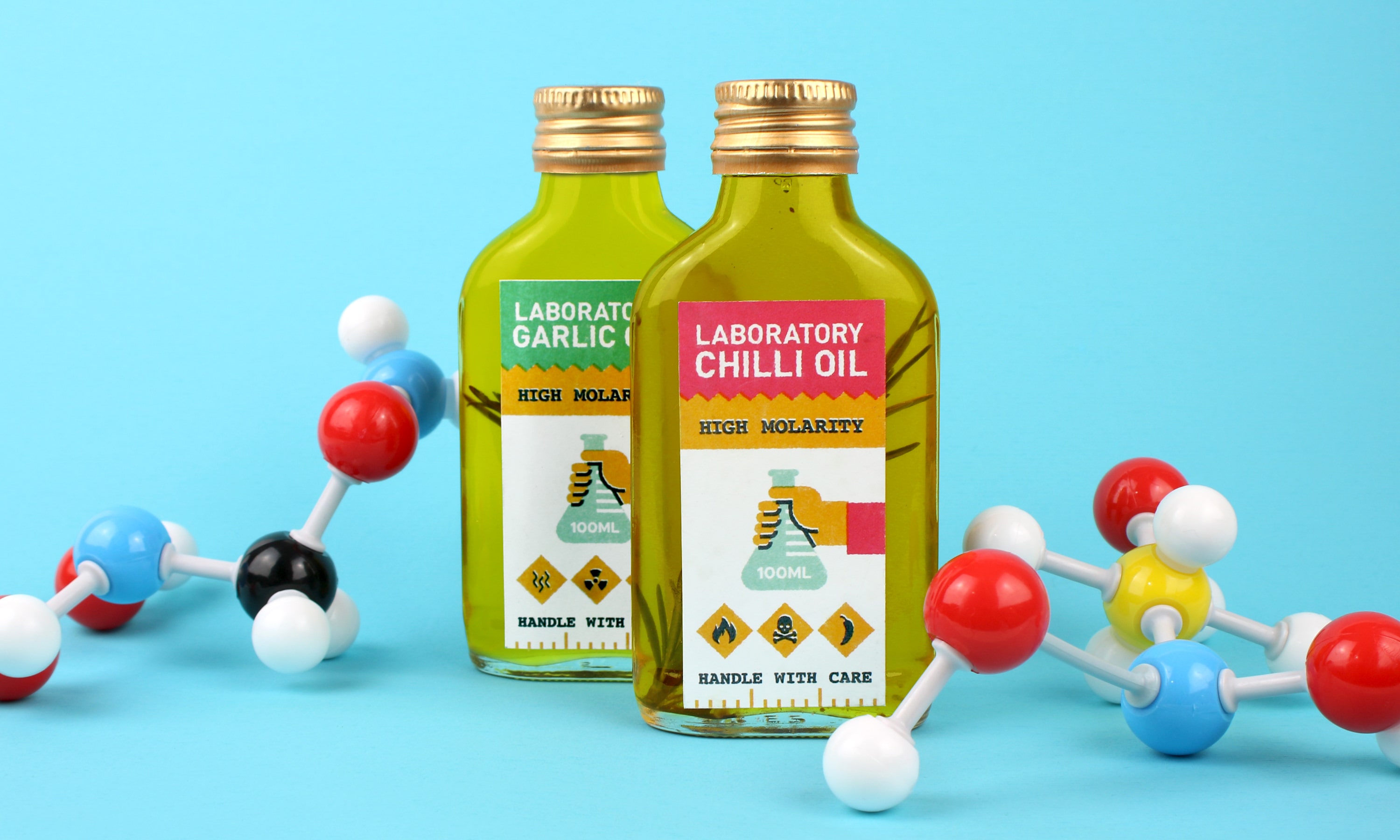
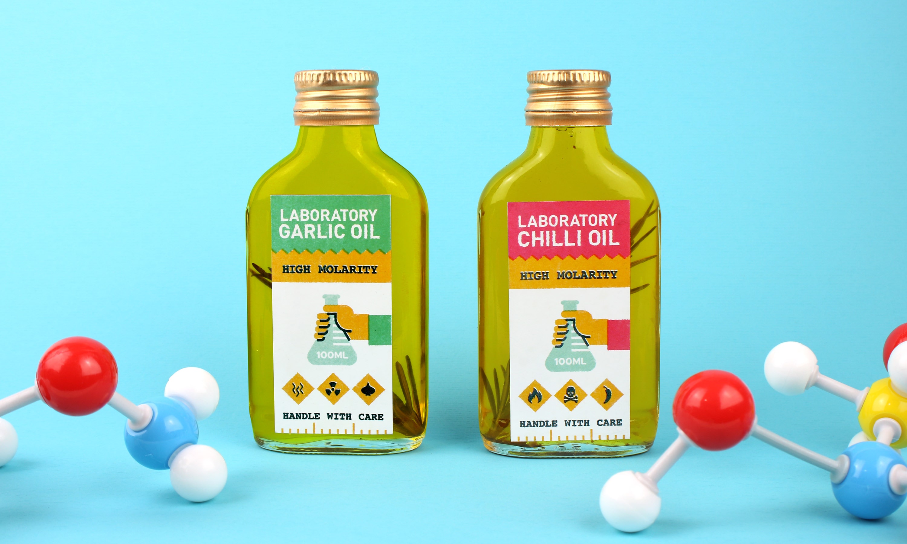
For the Laboratory Oil visual identity we set out to create a graphic language that is reminiscent of the high-school chemistry class from a bygone era. This was achieved through the combination of an accessible bold graphic style (typically found on warning labels) and the heavy assertive tone of the copy (i.e: "high molarity" and "handle with care").
The visual identity was inspired by constructivism and vintage stamps, with a deliberate misregistration of coloured print layers throughout.
Branding & Visual Identity
Print Design
Packaging