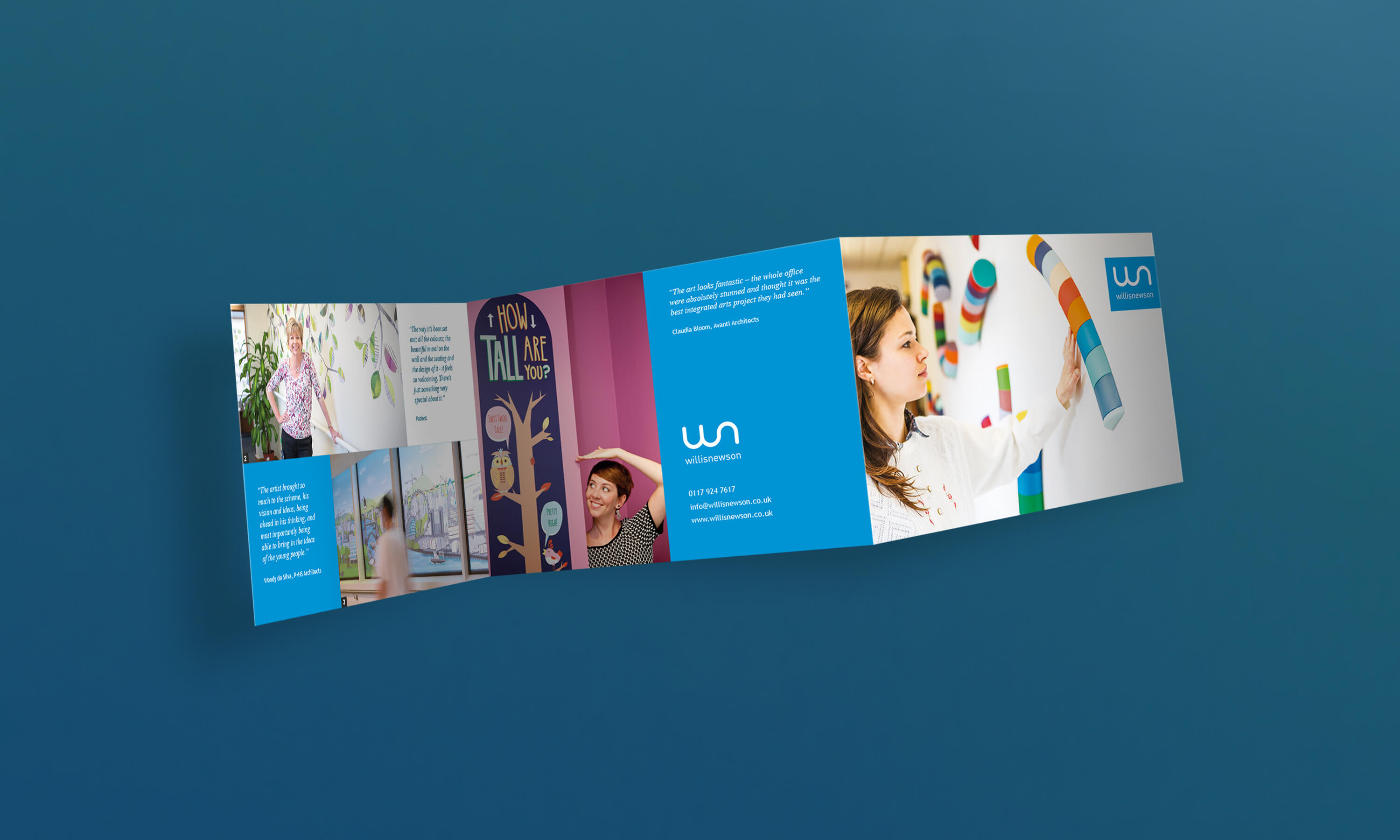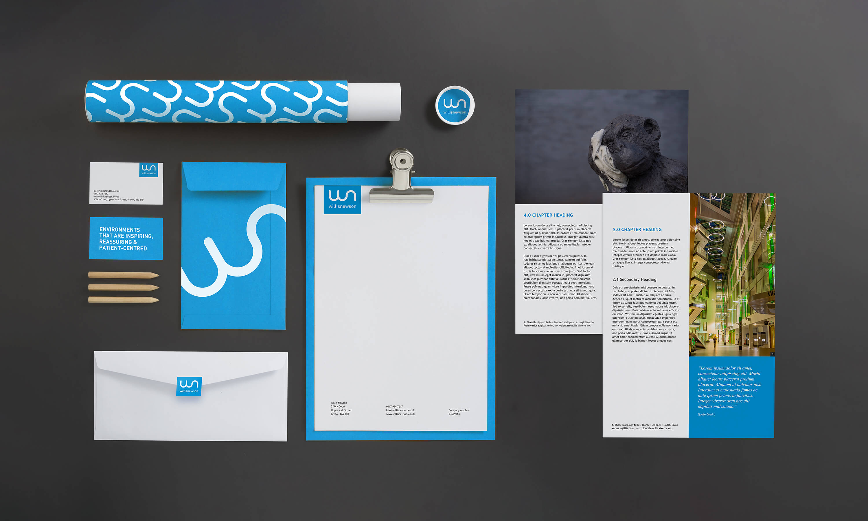
Willis Newson
For this brand refresh for an arts and health consultancy a wide range of printed collateral was considered.
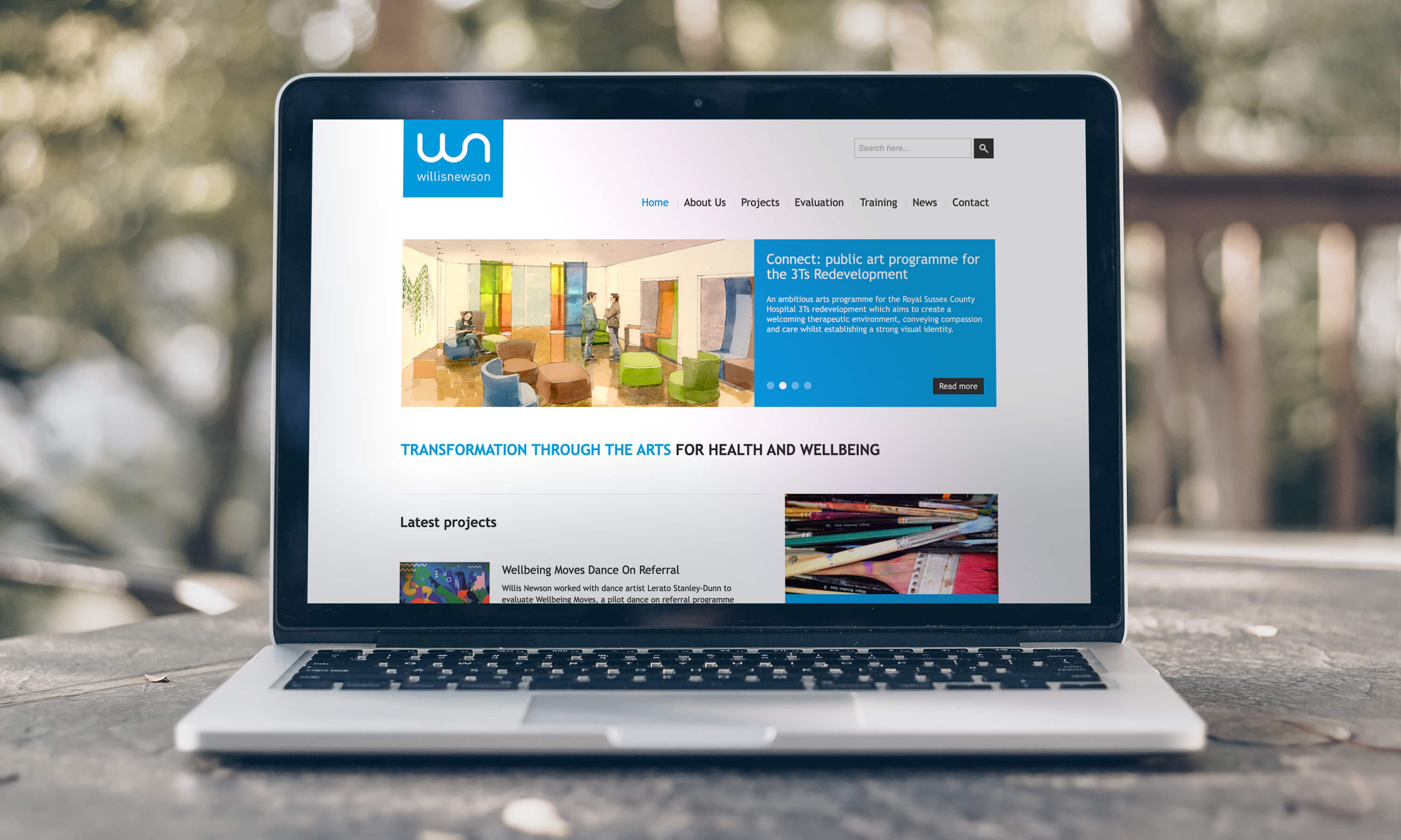
One of the key principles of this rebrand was to simplify and make more accessible. This included increasing the legibility for NHS staff, whom at the time were using older computer systems with web browsers that did not support the current standard of web fonts. Focusing on this key demographic and touchpoint limitations meant that ensuring web-safe typography feel unique and not dated became the heart of the project.
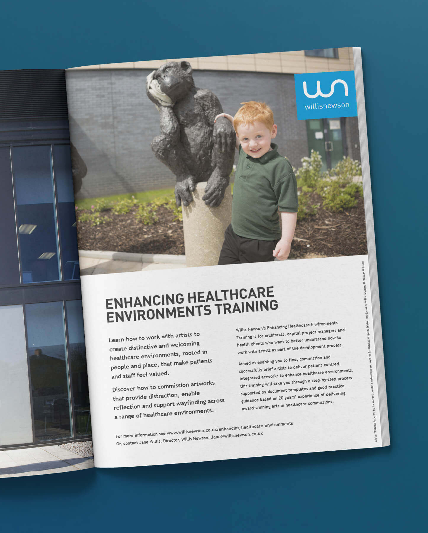
A grid-system was introduced across a number of different InDesign templates. These templates were designed to be used for tender, report, and case study documents.
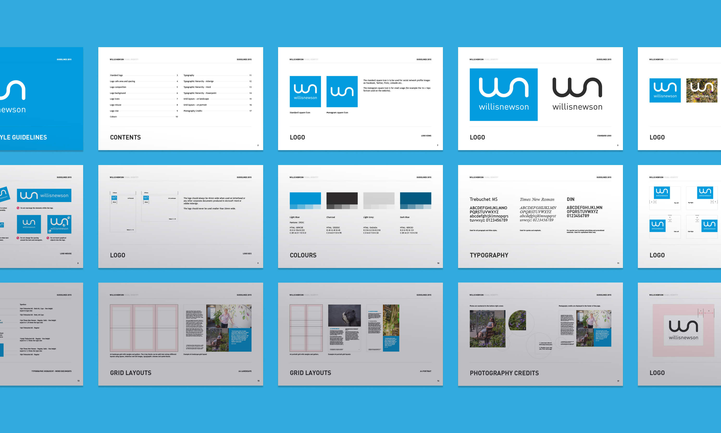
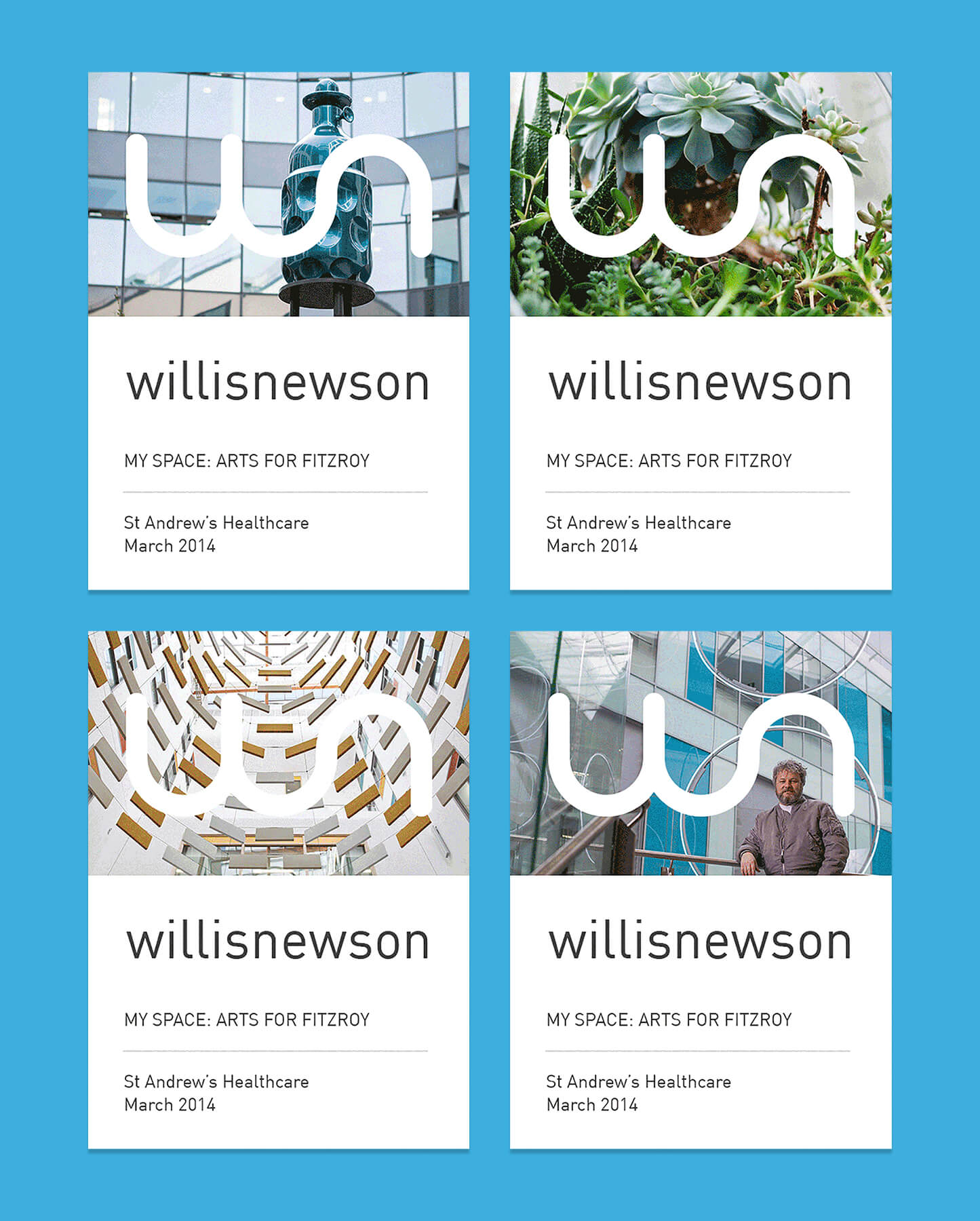
The logo became a simplified version of the previous version, and was designed to sit within a lozenge that could be used responsively across a vast range of outputs.